- Company Profile
-

(+61) 280113465
(+91) 03340624483
(+40) 745348765
(+1) 3603693187
(+1) 4387949227
-

-


blog
experience the excellence
Are You Aware of These Professional Logo Design Principles?

We all know that a logo creates a concentrated impact when it comes to impressing the target audience. More than that, it builds a bridge with the outside world which reveals the identity of the business. That is why it is always advised to collect enough information regarding the principles of the logo design when designing the best logo beyond anybody’s imagination. In fact, the best corporate logo design has the qualities of creative theory, blend of design skills as well as a knowledgeable application at the same time.
In that case, if you are thinking about revamping your old design or creating a new one, there are certain golden rules which are never ignored by the professionals. Hence, if you are wondering what those golden rules are, check the points given below.
Straightforwardness in shapes and symbolism
People who are into designing understand that shapes and symbols of a logo design play a vital role in promoting the name of the company. According to the professionals, simplicity of shapes and symbols are one of the most important principles of making a logo design. It is a general fact, that every popular brand in the industry is easily identified by their logo. Many professional graphic experts have the view that colors and shapes transcend the cultural as well as language barriers simultaneously. That is why it is significant to find the best shapes and symbols that suit your brands.
A modern logo with a timeless touch
People don’t make a new logo every two or three years. It has to be understood that frequent changes in logo never makes a good impression on the customers. To tell the truth, clients actually get confused and directionless. It is because of this reason, the aim should be to create a logo that is unique plus it has an eternal touch added to its colors, shapes and design. Most professionals spend lots of time doing extensive research so that they are able to come out with an idea that never gets outdated. If you are looking for an example then check the logo of Apple, Fila and others for inspiration.
Benefit from the competitive advantage of brand heritage
A particular advantage of heritage is that you can use it for the competitive advantage of the brand. A quality of heritage is that it portrays the history of the brand, its social status, as well as highlights inheritance simultaneously. It is also true that customers get more attracted to brands with a great heritage like Mercedes. In that case, the logo of the brand narrates its history through various signs and symbols. Therefore, when you are making a logo of a heritage brand, it is important to be mindful and take every step towards making the logo carefully.
Versatile and easygoing
Every graphic designer makes a logo not for limited use but for a long time. It has to be kept in mind that this logo will appear on every business card, billboard as well as in many other places. Also, it will be used in little spaces sometimes like a stamp or in the form of a marketing product.
Every professional unconsciously has this in mind that a complicated corporate logo design in USA is never appealing to the eyes. Furthermore, it also fails to deliver the message which the company aims to deliver through the logo.
On a concluding note, it is true that designing a quality logo is challenging but once you understand the elements and principles of making logo, you will be able to create a unique piece naturally.
close

PROJECTS
1132

WORKING DAYS
365

TEAM MEMBERS
220

HAPPY CLIENTS
890
Have Questions? Feel Free To Ask Us!
About Company
We cater our customers with the best IT solutions utilizing the most recent apparatuses and advancements in the business sector...
-
 Ecospace,
Esnt 3A0501 , Block 3A,
Ecospace,
Esnt 3A0501 , Block 3A,
5th Floor Plot No. IIF/11,
Kolkata, West Bengal - 700160 -
 033 4062 4483
-
 info@fitser.com
Partner of zimbra
Find Us On


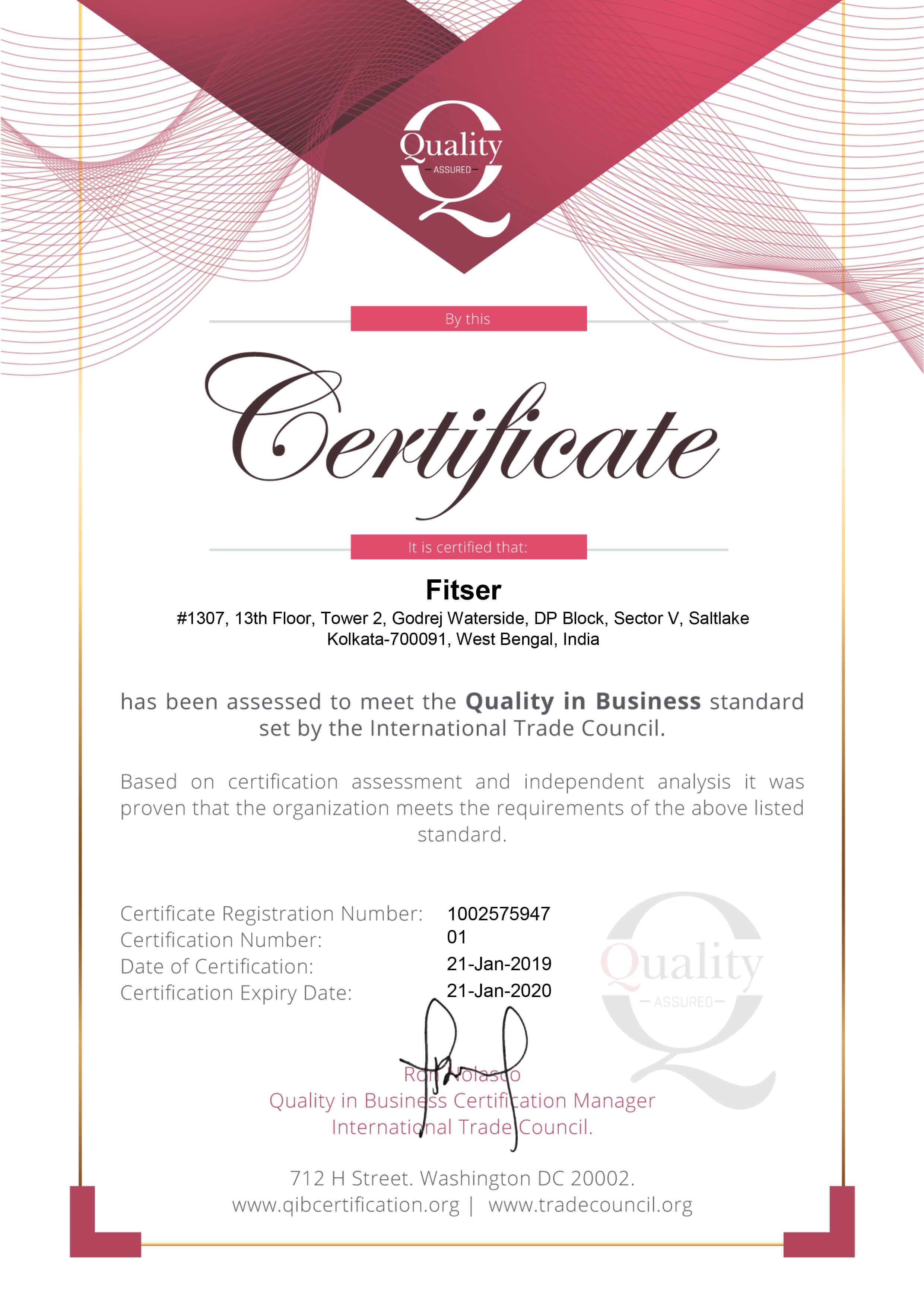
Certification